Tuesday 16 October 2012

Keeping the best...Sketch #45

Hello all,

Kepping the best... has a new sketch challenge up! Sketch #45. I was very fortunate to be a guest designer for this sketch. Here it is:


I did the layout on the weekend when I was in my floral mood...


My least favourite colours are orange and brown, yet whenever I scrap photos of my son, it is rare for me not to include the colour orange. As a result, I have quite a collection of orange flowers and elements in my stock, more so than my favourite colour of turquoise. I find this a little disturbing.

Anyway, here are some close-ups:


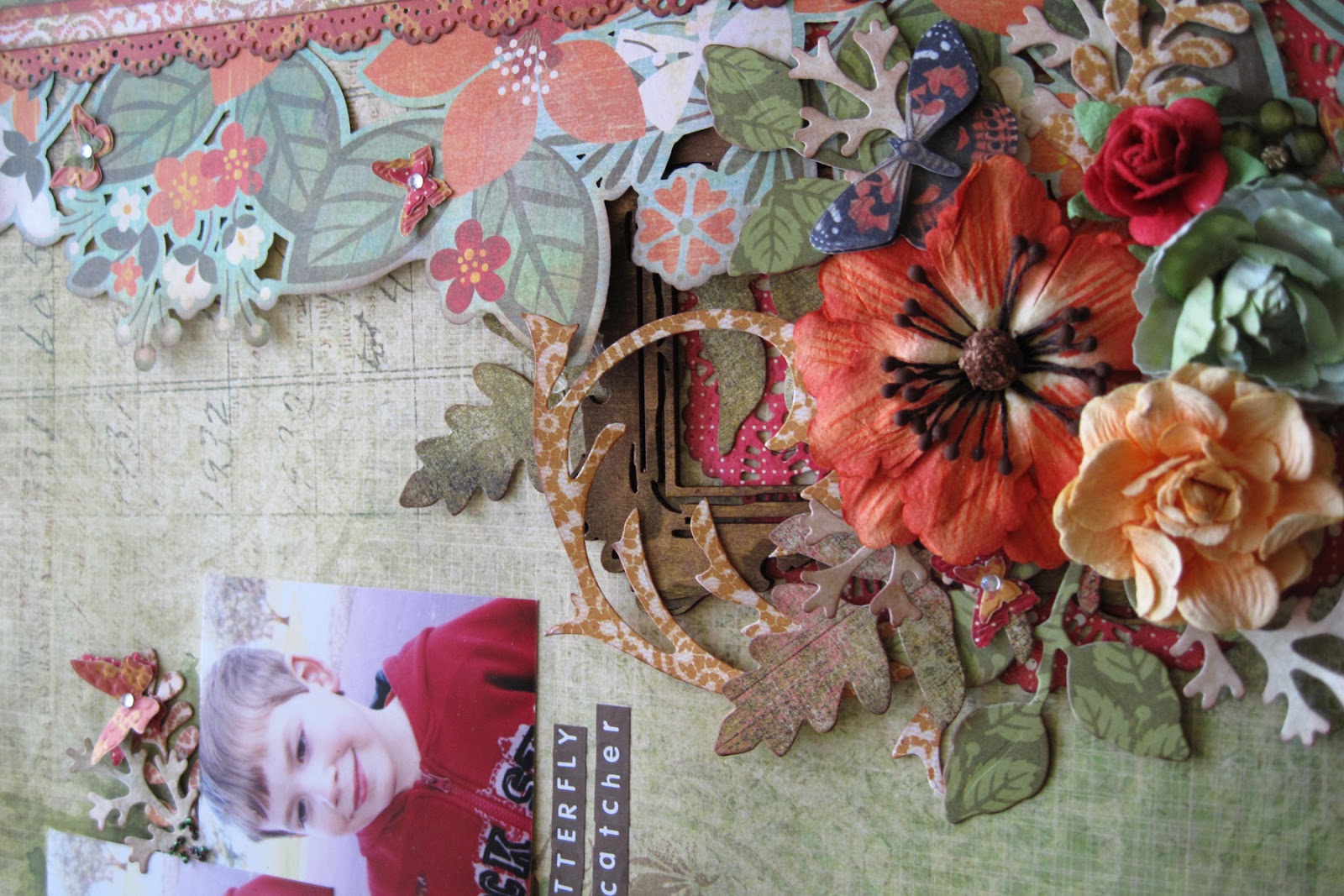
Supplies used: paper (Basic Grey, Crate Paper), flowers (Prima, Kaiser), wooden frame (Kaiser), acrylic paint, gel medium, glass beads, dies (Cheery Lynne Designs, Tim Holtz, Sizzix, Magnolia Ink, Stampin' Up), punches (EK Success, Martha Stewart), alphas (Kaiser).

Thanks for coming by. I look forward to seeing your layouts!

Sunday 14 October 2012

Keeping the best...Sketch Challenge #44

Hello,

I love the sketch challenges at Keeping the best..., and I love the diversity of syles from the designers. At the moment, there is Sketch Challenge #44, due today, October 14.

Here is the sketch:


And my version:


And some close-ups:


Supplies used: paper (watercolour paper, Basic Grey); flowers (Prima, Kaisercraft); brad, transparency, sparkles (Kaisercraft); die-cuts (Sizzix, Tim Holtz, Magnolia Ink, Cheery Lynn Designs); alcohol ink, glimmer mists, washi tape, velvet ribbon, alphas(American Crafts).

The background is a technique I've been wanting to try since I saw it done by the very inspiring and creative Riikka at Paperilitin (thankyou Riikka!). The step-by-step tutorial is here. Basically, it mixes glimmer mist with alchol ink. My version didn't quite work out as well as the one done by Riikka, but I still love the technique and the idea of an interesting result.

Initially I was going to go for a boysenberry/fuschia colour layout, but as I was progressing, I found the combination to be too much on its own, and felt an overwhelming need to introduce another colour. So there's a splash of green, a touch of orange, and a pinch of yellow (I couldn't decide on just one other colour!).

I go through stages of wanting lots of flowers and then not wanting any at all. Obviously, today was one of those days that flowers were needed. And I just can't resist some Prima flowers on these days. Also, on the top right of the photo, there is a tag that pulls out with journalling.


Thankyou so much for stopping by.


Thursday 11 October 2012

Scrap entre Amigas - Sketch #13

Hello there!

It's been a short while since I've been in blog-land. Apart from being busy with my children, I'm also studying for a degree at uni. I have a major assignment due, so my scrap-time has been very limited. But, I have managed to squeeze in a little time to keep me sane, and am entering the challenge at Scrap entre Amigas - Challenge # 13.

Here is the sketch:

Great sketch, and awesome colours. I used the colours as the starting point for my layout. It really governed what photo I was going to use.


And some close-ups:


Supplies used: Cardstock (Kraft Bazzill Basics); paper & elements (Amy Tangerine - American Crafts); prismacolor pencils; solvent; gesso; acrylic paint; alpha's (Kaisercraft, Thickers - American Crafts); stamps (Stampin' Up, Amy Tangerine - American Crafts).

I fussy-cut one of the papers then added more colour to it with the pencils. It gave more colour variation, and a richer, deeper colour that I was after. This was a really fun layout to do. I think the colours really evoke a sense of playfulness. Made me feel better anyway!

Thanks for stopping by to look.