And my version:
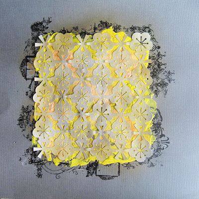
The background is explained below, but once I was satisfied with it, I used NeoColor II crayons (water soluble crayons which I just LOVE) that gave the yellow background.
And a few close-ups:
This layout turned out nothing like I had planned. What I initially did was this:
As you can see, I started with a dark grey cardstock, then added rub-ons around a lightly drawn square before adding yellow paint. I then sprinkled on some orange zing embossing powder and heat set it before adding my light grey die-cut shape. I didn't like it at all. Way too heavy looking for me. So to my rescue yet again, came the gesso. After drying, I then sprayed various yellow mists over it. I still didn't like it, so applied gesso yet again which ended up giving a yellow tinge to the top layer of gesso. This was satisfactory, so went ahead and used this as my background as above.
Back to study for me.
Thankyou for coming by.


very, very nice! such a complex textured background! great!
ReplyDeleteOoooh! I'm sooo glad you showed us what you originally intended...& how you altered it to be lighter looking & not so dense...& you're soo right - looks perfect how you ended up....amazing LO as always...just LOVE your ability to balance a design so perfectly, & of course, the colours are perfect as well!!! Thanks for joining us at SF & glad we gave you a break from study [& congrats on your feature last challenge:):):) So NOT surprising:):)]
ReplyDeleteGreat to see your process, TFS, the layout looks so stunning and the colours are amazing.
ReplyDeleteOh wow this looks amazing! Your layout really has been a work of art changing it until you were happy with it.. I love the back ground you ended up with, and love all the leaves and flowers, totally gorgeous layout!!
ReplyDeleteOh how stunning. The colours are perfect and your details and talent shine through.
ReplyDeletestunning layout!! soo beautiful!! and thanks for sharing the "before" photo too. glad you played along again :)!
ReplyDeleteThis is awesome!!!! Loving it!
ReplyDeleteWhat a transformation! LOVE all the textures and layers! Absolutely beautiful!
ReplyDeleteIt turned out really cool!! What machine do you use for the die cuts? The leaves look great too!!!!xx
ReplyDeleteThis is fabulous! I agree - you got the perfect amount of yellow in the end! I love the way you've ended up with a really unique and interesting page.
ReplyDeleteWOW! this is AMAZING..... That background is FAN TAB U LAS!!
ReplyDelete