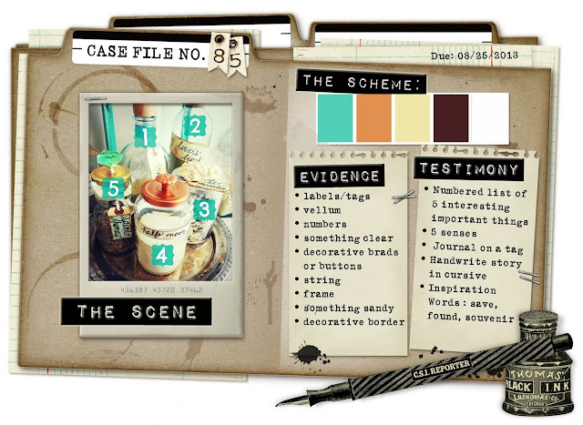
Love the inspiration file for this one.
And how I solved the case:
The photo is of my grandparents in Holland when they were engaged, in 1938.
I used a number of die-cuts from Kaiser, which allowed the layout to come together fairly quickly - well certainly not as long as it usually takes me. I think I'll use these die-cuts more often!
SCHEME: I used all the colours, but took the aqua to be a little darker.
EVIDENCE:
- tags
- numbers
- frame
TESTIMONY:
- Write your journaling on a tag
- Hand-write your journaling in cursive - I haven't written in cursive for a long time, so it's my version of cursive.:-)
- Inspiration word: SAVE
Journaling reads:
'Jeroen and Antonia are playing up for the camera, pretending to be busking to save money for their wedding.'
The layouts for inspiration are just AMAZING. Please make sure you have a look HERE.


Amazing!! That background - it makes me want to grab my paints and play, so inspirational!!
ReplyDeletexoxo
Hi Zeneva, I saw this layout over at CSI and had to visit your blog and leave a comment....absolutely Gorgeous...the background looks amazing, love the frame around the photo the twine tied around the paper abd the paper flower cluster....LOVE everything about it!!! Thanks for sharing your beautiful work. xx
ReplyDeleteI LOOOVE this....you've had a ball throwing paint around, now haven't you???!!!!!!!!!! Looks stunning, & that frame...yum...& yep! Die cuts are the WTG at times:):):)
ReplyDeleteThis is stunning! I love Kaiser die cuts too, they are really handy to pop on a page.. love the back ground details too.. well done on the challenge!
ReplyDeleteloooove that background splatter work and the gorgeous vintage feel.
ReplyDeleteWOW! that background is INCREDIBLE... Love this layout!! ♥
ReplyDeleteThank you for your kind comments on my blog. THis layout looks wonderful.
ReplyDeletethis is very pretty!!! *love*
ReplyDelete